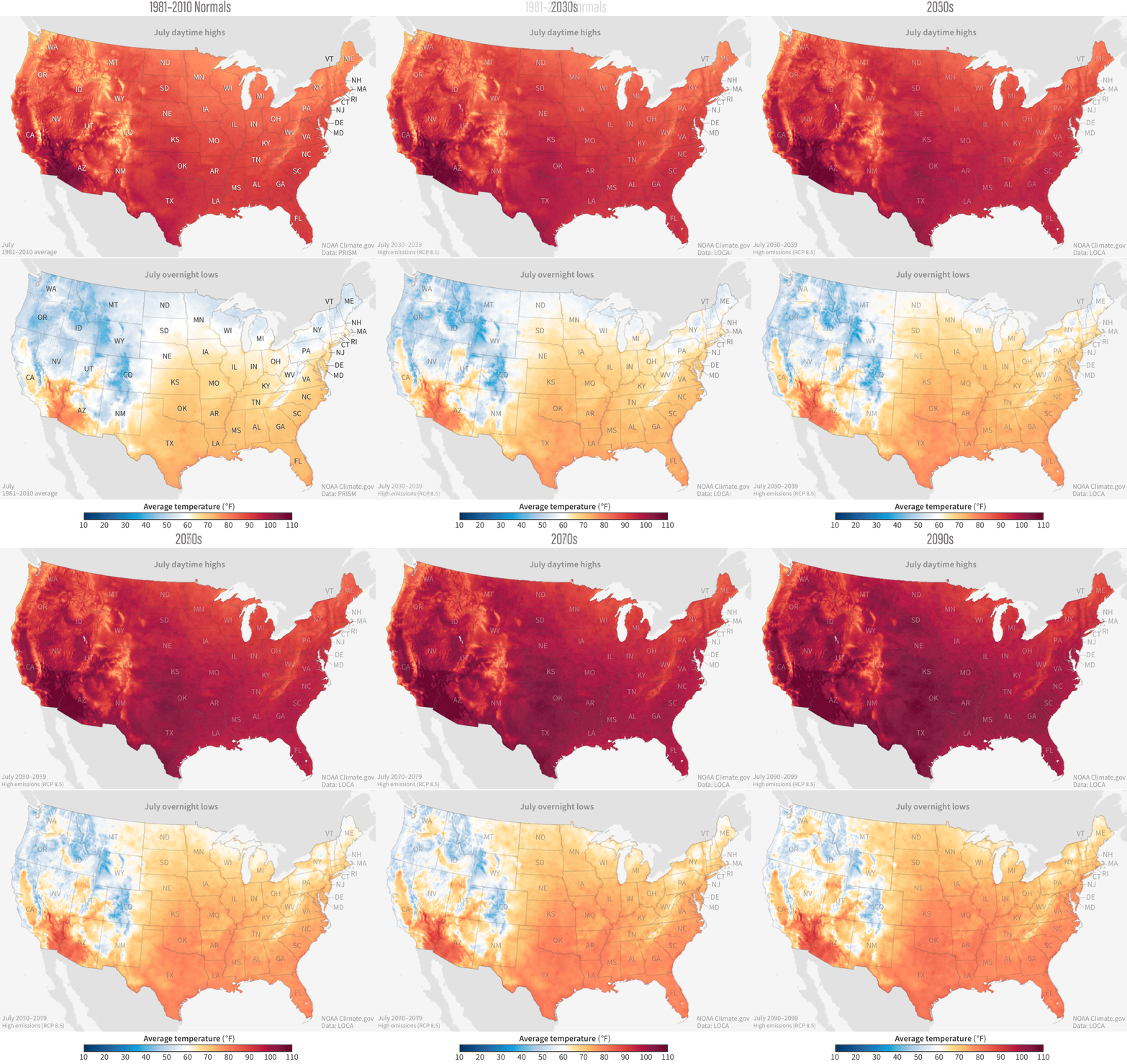
Past and future temperatures in the United States' hottest month of the year
Details
On average, July is the hottest month of the year for the contiguous United States. Since the start of the U.S. historical record in 1895, the average July day has gotten warmer at a rate of 0.83 degrees Fahrenheit per century. The average July night has warmed twice as quickly: 1.66 degrees F per century. How much more warming we can expect in future Julys depends largely on which greenhouse gas pathway we follow.
This animation shows how July temperatures (daytime highs on top, overnight lows on the bottom) are projected to increase in the future if the world follows a path of high greenhouse gas emissions. The first frame of the animation shows average temperatures over the period 1981-2020, based on PRISM data. The next steps show projected July average temperatures in future decades: the 2030s, 2050s, 2070s, and 2090s. The colors show temperatures warmer than 60 degrees in yellow, orange, and red, and temperatures cooler than 60 degrees in light to dark blue.
The average overnight low temperature in Julys from 1981-2020 show a roughly even national split, with about half the country having temperatures below 60 and half with temperatures above 60. With high emissions, models project that across nearly all of the country east of the Rocky Mountains, the average overnight low in July will be above 60 degrees by the end of the century. In many parts of the Southern Plains and around the Gulf of Mexico, the average night in July will be warmer than 80 degrees.
From 1981-2020, the coolest daytime high temperatures in July were in the Western mountains. With high emissions, places that averaged in the low 60s will be approaching the low 70s by the end of the century. From 1981-2010, places with average daytime highs above 100 degrees were mostly restricted to the Desert Southwest. On a high emissions pathway, those temperatures are likely to be widespread, dominating key crop-growing regions in California's Central Valley, Washington's Columbia River Plateau, and Idaho's Snake River plain; the Great Plains from Montana to Texas; and the Deep South.
For more information about how rising temperatures will affect human health, energy supply and demand, wildlife, and agriculture in different parts of the United States, see the Fourth U.S. Climate Assessment. To learn more about how people across the country are making their communities more resilient to climate extremes and future change, check out the these stories in the U.S. Climate Resilience Toolkit.
Map details
These maps are part of our Data Snapshots: Projected U.S. Temperatures collection. The collection includes U.S. maps of past and future temperature for each month of the year, decade by decade, from the recent past (1981-2020) to the end of the 21st century (2090s), following a pathway with either high greenhouse gas emissions or stabilized emissions. These results come from a suite of climate model simulations known as CMIP5/LOCA.
This animation shows results for the carbon dioxide pathway known as “RCP8.5”, which is a future in which global energy demands continue to be met with fossil fuels, resulting in high emissions of carbon dioxide over the coming decades. In our Data Snapshots collection, you can see how the future might evolve if we follow a pathway (“RCP 4.5”) that stabilizes emissions of heat-trapping gases by the middle of the century.
All maps in the collection are scaled the same and use the same color palette. The benefit of this approach is that maps from any month, any decade, or any greenhouse gas pathway can be compared. The trade-off is that the hottest and coldest months in the collection use only part of the color bar, which makes it somewhat harder to see the differences from place to place. To confirm temperature projections for your own county or other region of interest, you can search the maps with the Climate Explorer, part of the U.S. Climate Resilience Toolkit.
