Climate Conditions: Hot and Dry June in the Southwest
Details
In brief
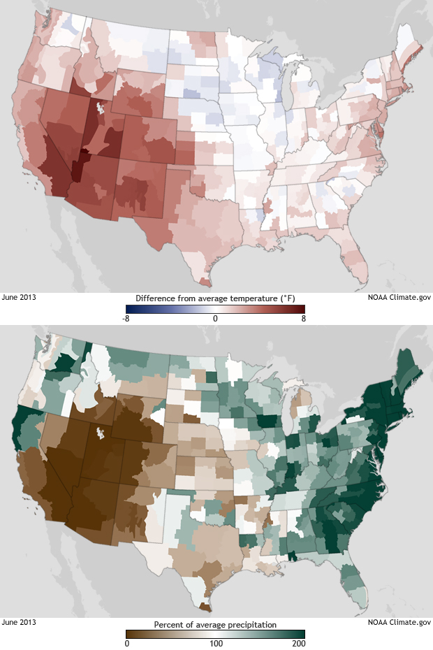
The Southwest received a double-whammy welcome to summer in June: the region was both much hotter and much drier than usual. The obvious red and brown areas at the lower left of each of these maps indicate the region that experienced hot and dry conditions. Across the rest of the contiguous United States, temperatures were closer to their long-term average, but the East Coast was inundated with rain, and many areas received nearly twice the amount of rain that usually falls on them in June.
The top image shows how much warmer or cooler each climate division was than its long-term average June temperature, measured from 1901 to 2000. Shades of red show where temperatures were warmer than average; shades of blue show where it was cooler than average. The darker the color, the larger the difference from average—white and very light areas were close to the long-term average temperature.
In a similar way, the bottom image shows how much more or less rain each climate division received than its long-term average total for June, also measured from 1901 to 2000. Shades of brown indicate where rainfall totals were below average; shades of green show where more rain than usual fell. Again, the darker the color, the larger the difference from average—white and very light areas had precipitation totals that were close to the long-term average.
More info
Temperature and precipitation records used to generate these maps come from automated and volunteer-operated weather stations in each of the 344 climate divisions of the contiguous United States. Rather than showing actual temperatures or precipitation totals, the colors show how different June 2013 was from average values for all Junes during the 20th century.
Colors and values on this pair of maps are different from those on this similar-looking post for two reasons. First, tthese images show values for June (only), but the previous post shows year-to-date observations for January through June. Secondly, the long-term averages for temperature and precipitation in this post were calculated over the entire 20th century, from 1901 to 2000, but the previous post uses a base period of 30 years, from 1981-2010.
These climate statistics and many others are part of NOAA’s National Monthly Climate Report. The Climate Monitoring Branch at the National Climatic Data Center produces these reports as part of the suite of climate services that NOAA provides government, business, and community leaders to help them make informed decisions. Additional maps of various temperature and precipitation statistics are available through the Climate at a Glance mapping tool.
Technical Details
