April 2010: Warmest On Record
Details
Across the globe, over land as well as sea, Earth’s average surface temperature for April 2010 made it the warmest April on record.
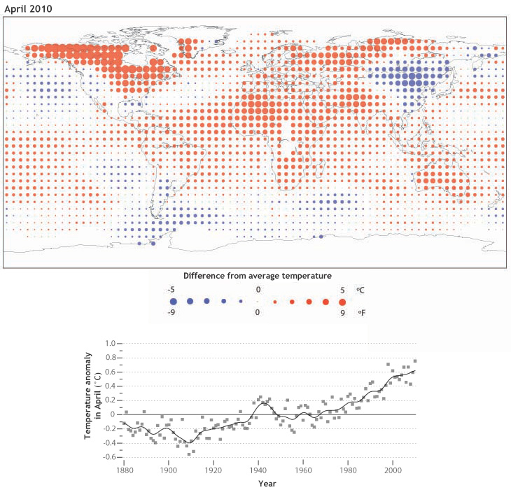
The map at right shows temperature anomalies, a comparison of how much warmer or cooler each location was in April 2010 compared to its average temperature for April from 1971-2000. Locations across Canada that show the largest red dots were an average of 5°C (9°F) warmer than average. In contrast, blue dots such as those across China show areas that were cooler than average.
Over the entire globe, the average temperature for April 2010 was 0.76°C (1.37°F) warmer than the average for April from 1901-2000. This was the 34th consecutive April with an average global temperature above the 20th century average.
The graph shows how global temperature for each April from 1880 to 2010 compared to the average. The zero line represents the long-term average from 1901-2000, and plotted squares show the departure from average for each year. The solid black line shows a moving average, or trend, for global temperature during April.
Climatologists use temperature anomalies—the difference between measured and average temperatures—to track change over time. In contrast to raw average temperatures, anomalies isolate change in temperature over time from other factors. For example, the temperature measured on a hilltop is likely to be lower than the temperature in a nearby valley on any day. As the region warms or cools, the difference from the average temperature at both places will show a similar trend.
The long-term average of temperature for a portion of the year represents one measure of climate. A persistent positive or negative departure from average indicates that climate is changing.
Related
NCDC State of the Climate Global Analysis for April 2010
