File name: NF-CPC-SO-CONUS-Albers-0700-temp-2019-10-17.png
Original Resolution: 700 × 460
File Size: 154 KB (MIME Type: image/png)
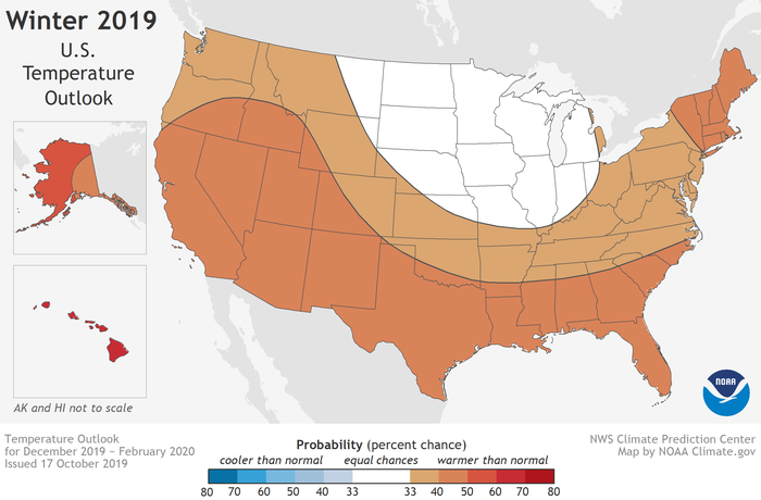
Each winter, NOAA forecasts the odds for each of three possible temperature outcomes: well above, well below, and near average. Places where forecasters determined that well above average temperatures are most likely this winter are colored in shades of red. Well above means "in the upper third" of winter temperatures observed from 1981-2010. Darker colors mean higher chances, not warmer temperatures. Places where forecasters determined that realtively warm, cool, or average temperatures are all equally likely are white. Map by NOAA Climate.gov, based on data provided by CPC.