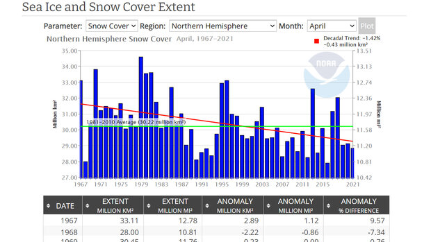
This tool generates bar graphs showing monthly extent of sea ice in the Northern or Southern Hemisphere, or for the entire globe. Each graph includes the long-term average extent and the trend over the full period of record. The tool can also generate bar graphs of snow cover by month for the entire Northern Hemisphere or subregions within it. The bar graphs are interactive: you can zoom and pan on the image to examine different portions of the graph.
Where do these data come from?
Instruments on satellites measure the amount of light Earth reflects at various wavelengths to determine which areas have snow or ice at the surface. These areas are plotted on maps and the average total extent for each is computed and recorded in a database. Sea ice extent data are provided by the National Snow and Ice Data Center (NSIDC). The Rutgers University Global Snow Laboratory (GSL) provides measurements of snow cover.
-
What can I do with these data?
Users can generate and examine graphs and statistics on ice and snow, or download the data to populate spreadsheets for further analysis. The graphs illustrate how snow and ice extent have changed for specific months over the past four decades. The graphs also enable users to compare sea ice trends between the Arctic and Antarctic regions.
How do I use the site?
Use the pull down menus to select what (sea ice or snow cover), where (hemisphere or region), and when (which month, or for all months). Click Plot to display a graph of the data. A table of the data appears below the graph, along with options for downloading it.
-
Data Format(s)CSV, XML, Other
Access Type Link & Description Graphing Produce graphs for any month or the whole year. -
Data TypeSatelliteEssential Climate VariablesSea ice,Science OrganizationNCDCEmailncdc.satorder@noaa.gov
 Click to see more detail
