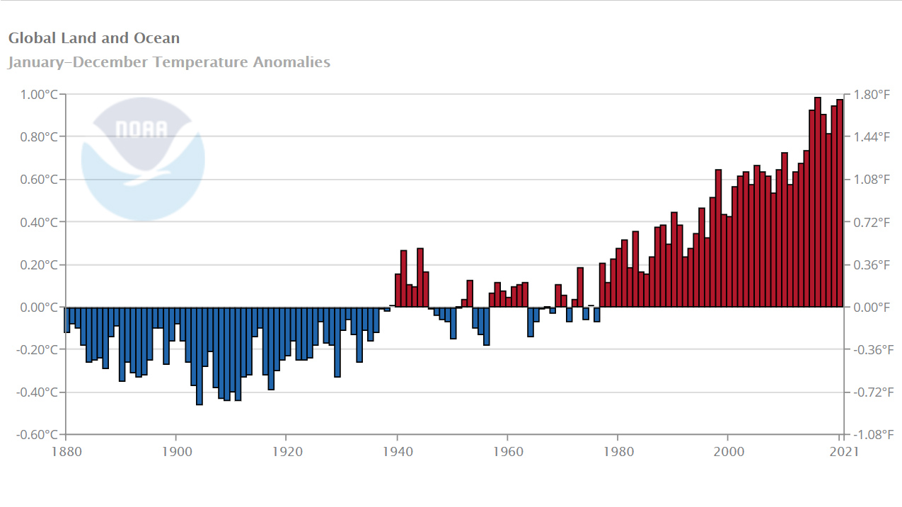
One of the most obvious signals of climate change is the rise in global average temperature over the past several decades. Comparing the average temperature of land, ocean, or land and ocean combined for any month or multi-month period to the average temperature for the same period over the 20th century shows if conditions are warmer or cooler than the past.
Where do these data come from?
Temperature data come from manual and automated weather stations. Quality-checked data become part of the Global Historical Climatology Network-Monthly (GHCN-M) data set and International Comprehensive Ocean-Atmosphere Data Set (ICOADS). A combined global land and ocean temperature anomaly dataset was created from these resources.
The Smith and Reynolds blended land and ocean data sets is used to produce the Global time series. Monthly average temperature anomalies are plotted on a grid across land and ocean surfaces. An average global temperature anomaly is then created from the complete grid.
-
What can I do with these data?
Using this site, data can be selected, graphed, and saved for the different parameters. Trends can be compared for different time periods.
After plotting the desired data, a link is created for the results allowing you to save the web address.
How do I use the site?
Under Climate at a Glance > Time Series > Globe, use the pull down menus to set options:
- Timescale and Month
- Start and End Year
- Latitude Band (hemispherical)
- Surface (ocean or land)
- Option to display a Trend Line
-
Data Format(s)CSV, JSON, XML
Access Type Link & Description Graphing Browser-based tool for generating graphs -
Data TypeLand-based station, Marine / OceanEssential Climate VariablesAir temperature,Science OrganizationNOAA NCDCEmailncdc.orders@noaa.gov
 Click to see more detail
